We enhanced the A+ Content by refining the visual hierarchy and creating a more engaging layout. This included highlighting key product features through a mix of high-quality product-only images and lifestyle visuals that resonate with the target audience. To improve clarity and usability, we reorganized the text blocks, ensuring that essential information stood out while maintaining a clean, cohesive design. Additionally, we strengthened brand presence by incorporating consistent branding elements, including updated color schemes and logos, to build trust and familiarity. These changes were aimed at improving customer engagement, making the product benefits clearer, and ultimately boosting conversion rates.
We applied our winning design layout and carried out similar enhancements to two separate products A+ Content, after carrying out a 6-week split test here are the results.
Product A
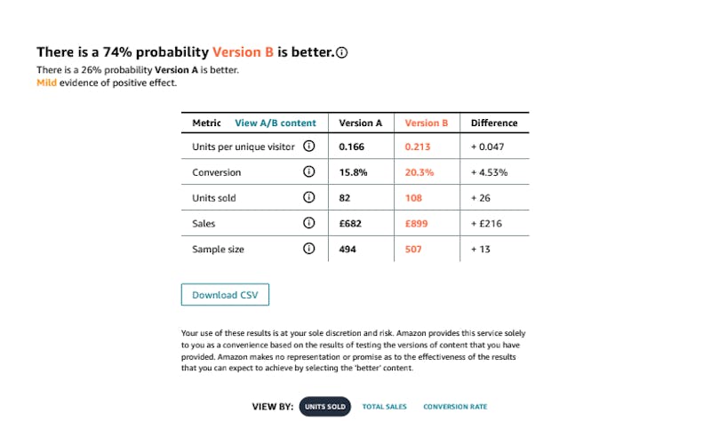
Version B showed a clear improvement over Version A across all key metrics. Units sold per unique visitor increased by 28.3%. The conversion rate improved from 15.8% to 20.3%, an increase of 28.5%. Total units sold rose from 82 to 108, reflecting a growth of 31.7%. Additionally, total sales revenue increased from £682 to £899, a growth of 31.7%. The results showed that there was a 74% chance that the new images (Version B) performed better than the old ones (Version A).

Product B
Version B delivered notable improvements compared to Version A. Units sold per unique visitor increased from 0.3 to 0.337, reflecting a growth of 12.3%. The conversion rate rose from 28.6% to 30.9%. Total units sold increased from 350 to 387, showing an increase of 10.6%. Additionally, total sales revenue grew from $3,490 to $3,854, resulting in a gain of $364. The results showed that there was a 73% chance that the new images (Version B) performed better than the old ones (Version A).

